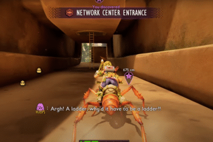
Although we’re almost two years into a new console generation, we’re heading into a relatively light summer in terms of “flagship releases“. If you’re willing to dig a little deepe.
Good design is making something intelligible and memorable. Great design is making something memorable and meaningful.
Dieter Rams
Online multiplayer shooters, like CS:GO, Fortnite, and PUBG, are currently dominating the gaming world, thanks to professional gamers, esports tournaments.
What is the most played game right now?
Not all websites are made equal. Some websites are simple, logical, and easy to use. Others are a messy hodgepodge of pages and links.

Without website navigation, your visitors can’t figure out how to find your blog, your email signup page, your product listings, pricing, contact information, or help docs.
Quick and easy access to the content they’re after is more important for your website users than a… visually-stunning design.
Bad navigation is an especially common problem. We’ve all struggled to find things on disorganized websites without any logical structure. It feels hopeless.
A word on mainstream gaming sites
In design, rhythm is created by simply repeating elements in predictable patterns. This repetition is a natural thing that occurs everywhere in our world. As people, we are driven everyday by predictable, timed events.

One of the best ways to use repetition and rhythm in web design is in the site’s navigation menu. A consistent, easy-to-follow pattern—in color, layout, etc. Gives users an intuitive roadmap to everything you want to share on your site.
What is the most successful mobile game?
Nobody enjoys looking at an ugly web page. Garish colors, cluttered images and distracting animation can all turn customers “off” and send them shopping “somewhere else”
- Direct the Eye With Leading Lines
- Balance Out Your Elements
- Use Elements That Complement Each Other
- Be clear about your “focal points” and where you place them
Trending games on other platforms
UX and UI: Two terms that are often used interchangeably, but actually mean very different things. So what exactly is the difference?
Styles come and go. Good design is a language, not a style.
Massimo Vignelli
UX design refers to the term “user experience design”, while UI stands for “user interface design”. Both elements are crucial to a product and work closely together.
What to look for when buying games for kids
Good design guides the user by communicating purpose and priority. For that reason, every part of the design should be based on an “informed decision” rather than an arbitrary.

Provide distinct styles for interactive elements, such as links and buttons, to make them easy to identify. For example, “change the appearance of links” on mouse hover, “keyboard focus”.
Game publishers performance
Design is not the end-all solution to all of the worlds problems — but with the right thinking and application, it can definitely be a good beginning to start tackling them.


